
Monitoring Your Linq Blue Lines in Linq Zero
The new Analytics tab in Linq Zero gives you a single place to monitor the health and performance of every Linq Blue line in your organization. Instead of checking lines one at a time, you get fleet-wide visibility into line reputation, message delivery, engagement quality, errors, and API performance — all in real time.
This is the fastest way to spot a line trending toward throttling or flagging before it becomes a problem.
Where to Find the Analytics Tab
- Log in via browser to your Linq Zero dashboard at zero.linqapp.com.
- In the left-hand navigation, click the Analytics icon (marked NEW).
- You'll land on the Overview tab, with five additional tabs across the top:
- Overview — the health summary for your whole fleet
- Fleet Status — line-by-line reputation and delivery
- Engagement — conversation quality and volume
- Error Tracking — delivery failures and error rate
- API Latency — API request performance (API/integration users)
- Delivery Latency — how fast iMessages actually send and deliver
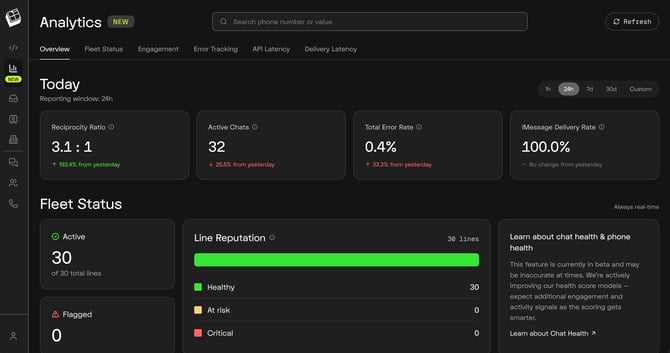
Global Controls
These controls appear at the top of the page and apply everywhere.
- Search phone number or value — jump straight to a specific line or look up a value (such as a message ID) without scrolling through tables.
- Refresh — pulls the latest data on demand.
- Time range selector — 1h, 24h, 7d, 30d, or Custom. The Reporting window label under the page title always confirms which range you're viewing.
- Engagement time range — the Engagement section uses a longer scale: 2w, 4w, 6w, 12w, or Custom.
Note: Comparison text such as "from yesterday" or "vs prior week" is always measured against the equivalent previous period. Color indicates good vs. bad, not up vs. down — for example, a drop in Inactive Chats displays in green because fewer inactive chats is a positive result.
Overview Tab
The Overview tab is your daily check-in. If everything here looks normal, your fleet is healthy.
Today's Key Cards
- Reciprocity Ratio — the balance of inbound messages received to outbound messages sent (e.g. 3.1 : 1 means you received roughly three replies for every message sent). The higher your inbound, the reduced likelihood of being flagged.
- Active Chats — conversations with recent two-way activity in the selected window.
- Total Error Rate — the percentage of messages that failed to send across all lines.
- iMessage Delivery Rate — the percentage of iMessages successfully delivered. This should sit at or near 100%.
Fleet Status Summary
Marked Always real-time, regardless of the time range you've selected.
- Active — how many lines are currently active out of your total (e.g. 30 of 30 total lines).
- Flagged — how many lines are currently flagged. This number should always be 0.
- Line Reputation — a color bar splitting your fleet into Healthy, At risk, and Critical.
API & Delivery Latency Summary
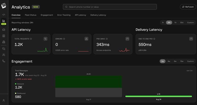
- Total Requests and Errors — API call volume and failure count, with error rate.
- P99 (MAX) — the slowest 1% of API responses across all endpoints.
- End to End P50 — the median time from API call to message delivered.
Engagement Summary
- Total Messages for the current week, with the percentage change vs. the prior week.
- Inbound vs. Outbound message split.
- A two-week bar comparison so you can see volume swings at a glance.
Use the Overview to answer one question each morning: is anything red that was green yesterday?
Fleet Status Tab
The Fleet Status tab is where you manage line health line by line.
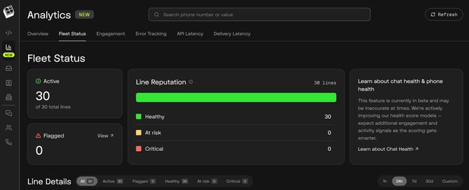
Line Reputation
Every line is scored into one of three buckets:
| Reputation | What it means | Action |
|---|---|---|
| Healthy | Normal sending patterns and healthy engagement | No action needed |
| At risk | Early warning signs — low reciprocity or rising errors | Adjust messaging behavior now |
| Critical | Sending patterns strongly associated with throttling or flagging | Pause outbound on that line and contact your PSM |
The Flagged card includes a View link that takes you directly to any flagged lines.
Line Details Table
Filter the table by All, Active, Flagged, Healthy, At risk, or Critical, and set your own time range.
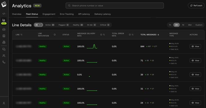
Each row shows:
- Line — the phone number.
- Line Reputation — Healthy / At risk / Critical.
- Status — Active or inactive.
- iMessage Delivery Rate — with a sparkline showing the trend across the window.
- Total Error Rate — failed messages as a percentage for that line.
- Total Messages — total volume, broken out by inbound (↓) and outbound (↑).
- Message Type — the split across iMessages, RCS, and SMS.
- Actions — View opens the full detail for that line.
Use this to:
- Spot lines sending far more than they receive (outbound ↑ much higher than inbound ↓).
- Catch a line falling back to SMS. A line showing SMS 100% and a 0.0% iMessage Delivery Rate is not delivering blue messages and needs to be investigated.
- Identify your highest-volume lines and confirm they're still rated Healthy.
- Balance workload across the fleet instead of overloading one number.
Engagement Tab
The Engagement tab measures conversation quality, not just volume. The badge next to the title (e.g. 13 lines) shows how many lines had activity in the selected window.
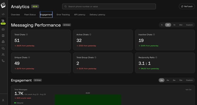
Messaging Performance Cards
- Total Chats — all conversations in the window.
- Active Chats — conversations with recent two-way activity.
- Inactive Chats — conversations that have gone quiet. A decrease here is a good sign and displays in green.
- Unique Chats — distinct contacts messaged, which helps you separate reach from repeat volume.
- Total Group Chats — group conversations in the window.
- Reciprocity Ratio — inbound to outbound balance, the single best predictor of line health.
Engagement Trend
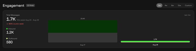
- Total Messages for the current week with the week-over-week change.
- Inbound and Outbound totals.
- Week-over-week bars so large swings are obvious.
Use this to:
- Confirm outbound campaigns are producing replies, not just sends.
- Investigate sharp volume drops (a paused workflow, a broken integration, or a throttled line).
- Track whether coaching or messaging changes actually improved reciprocity.
✅ Best practice: Watch Reciprocity Ratio and Active Chats together. Rising outbound volume with a falling reciprocity ratio is the clearest early warning that a line is heading toward throttling.
Error Tracking Tab
The Error Tracking tab shows exactly what failed, when, and on which line.
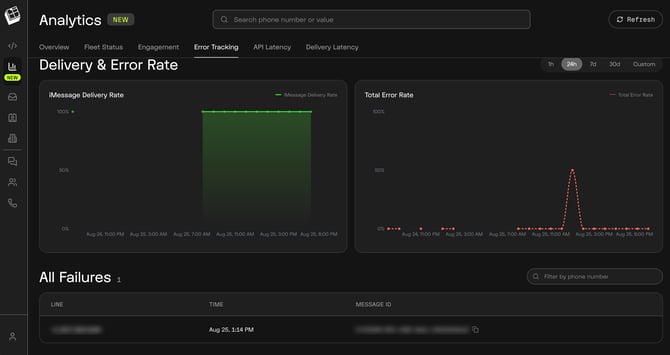
Delivery & Error Rate Charts
- iMessage Delivery Rate — plotted over the selected window. A flat line at 100% is what you want.
- Total Error Rate — plotted on the same timeline. Isolated spikes are usually a single failed message; sustained elevation points to a line or integration problem.
All Failures Table
Every individual failure is listed, with a Filter by phone number search:
- Line — the number the failure occurred on.
- Time — the exact timestamp of the failure.
- Message ID — a copyable unique identifier.
Use this to:
- Match a customer's "I never got your text" report to a specific failure.
- Copy the Message ID and send it to Linq Support so the exact message can be traced.
- Confirm whether a delivery problem is isolated to one line or affecting the fleet.
API Latency Tab
The API Latency tab is for teams sending through the Linq API or a CRM integration. If you message only from the Linq Zero inbox, you can skip this tab.
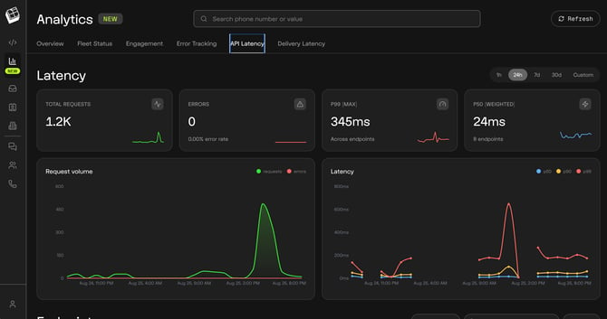
Latency Cards
- Total Requests — API calls in the window.
- Errors — failed calls, with the error rate. This should read 0.00%.
- P99 (MAX) — the slowest 1% of responses across all endpoints. This is your worst-case experience.
- P50 (Weighted) — the typical response time, weighted across your endpoints.
Charts
- Request volume — requests and errors plotted together, so you can see whether traffic spikes cause failures.
- Latency — p50, p90, and p99 on one timeline. When p99 spikes but p50 stays flat, a small number of slow calls are the issue, not a system-wide slowdown.
Endpoints Table
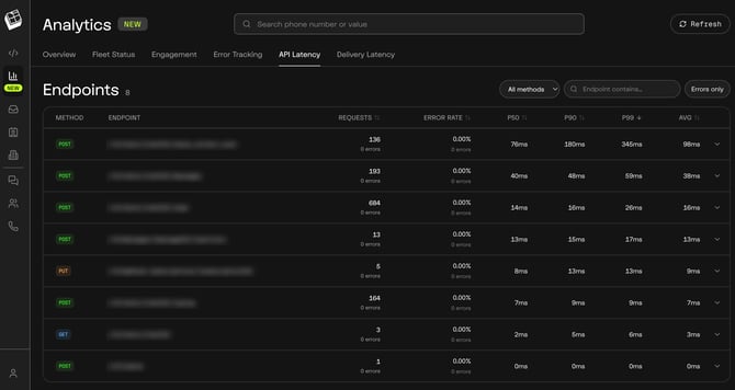
Filter by method, search with Endpoint contains…, or toggle Errors only to jump straight to problems.
Each endpoint shows Method, Endpoint, Requests, Error Rate, P50, P90, P99, and Avg — so you can tell the difference between a slow endpoint and a rarely used one.
Recent Requests
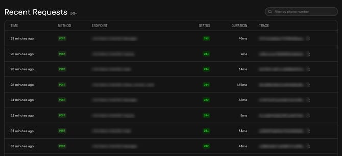
A live feed of individual calls showing Time, Method, Endpoint, Status, Duration, and a copyable Trace ID.
Use this to:
- Verify an integration is actually firing after you build a workflow.
- Confirm status codes are returning as expected (2xx responses).
- Copy a Trace ID for support when a specific call misbehaves.
Delivery Latency Tab
The Delivery Latency tab answers a different question than API Latency: how long does it take for a message to actually reach the recipient?
This tab measures the time from your API call to message.sent and message.delivered, and covers iMessage only.
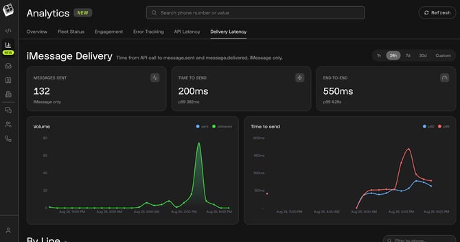
Delivery Cards
- Messages Sent — iMessage volume in the window.
- Time to Send — how long it takes Linq to hand the message off, shown with its p99.
- End-to-End — the full journey from API call to delivered on the recipient's device, shown with its p99.
Charts
- Volume — sent vs. delivered plotted together. These two lines should track each other closely; a gap means messages are sending but not landing.
- Time to send — p50 and p99 over time.
By Line Table
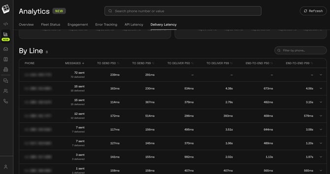
Every line broken out, filterable by phone number:
- Messages — sent vs. delivered counts. These should match.
- To Send P50 / P99 — Linq-side send speed.
- To Deliver P50 / P99 — carrier and Apple-side delivery speed.
- End-to-End P50 / P99 — total time from API call to delivery.
Note: A dash (—) in the deliver or end-to-end columns means delivery receipts weren't returned for those messages, so no delivery time could be calculated. The sent metrics are still valid.
Use this to:
- Separate a Linq-side delay (high To Send) from a carrier/Apple-side delay (high To Deliver).
- Spot a single line with unusually slow delivery while the rest of the fleet is fine.
- Set realistic expectations for time-sensitive sends.
Quick Reference: What "Good" Looks Like
| Metric | Healthy | Investigate |
|---|---|---|
| Line Reputation | All lines Healthy | Any line At risk or Critical |
| Flagged Lines | 0 | 1 or more |
| iMessage Delivery Rate | At or near 100% | Sustained dips, or a line at 0% |
| Total Error Rate | Near 0% | Sustained elevation, not one-off spikes |
| Reciprocity Ratio | Well above 1:1 | Trending toward or below 1:1 |
| Sent vs. Delivered | Counts match | Delivered consistently below sent |
| API Error Rate | 0.00% | Any recurring errors |
| Message Type Split | Majority iMesss | A line falling back to mostly SMS |
A Simple Weekly Routine
- Overview — confirm Flagged is 0, delivery rate is near 100%, and reciprocity is stable.
- Fleet Status — filter to At risk and Critical. Address those lines first.
- Engagement — check whether outbound volume is producing replies.
- Error Tracking — review any failures and copy Message IDs for support.
- API / Delivery Latency — if you're on an integration, confirm requests are firing and delivery times are normal.
✅ Best practice: The Analytics tab is a preventative tool. Acting on an At risk line takes a few days of adjusted behavior; recovering a flagged line requires intervention from Linq and Apple and can take 24+ hours or longer. Catch it early.
Notes & Limitations
- Line Reputation and Chat Health are currently in beta and may be inaccurate at times. Linq is actively improving these health score models, and additional engagement and activity signals will be added as scoring gets smarter.
- Delivery Latency covers iMessage only. SMS and RCS traffic is not included in that tab.
- The line count badges (e.g. "13 lines," "8") reflect how many lines or endpoints had activity in the selected window — not your total fleet size.
- Currently not available on the mobile app.